A Data-Based Analysis of Hacker News
Or: 2048 Con, asking Edward.
After spending a little too much time reading Hacker News, I decided to take a more systematic look at what ends up on HN and what does well. This analysis inspired the alternate title – read on to find out more.
As a quick reminder, Hacker News is a website about a wide-range of subjects – everything from philosophy and design to job postings and programming languages. Hacker News, or as my classmates called it “that hacker website”, is frequently compared to reddit. A similar analysis of reddit was pretty interesting, so I wanted to explore how Hacker News would compare (albeit with a more exploratory approach).
Of note: I did this entirely for fun; don’t take it too seriously.
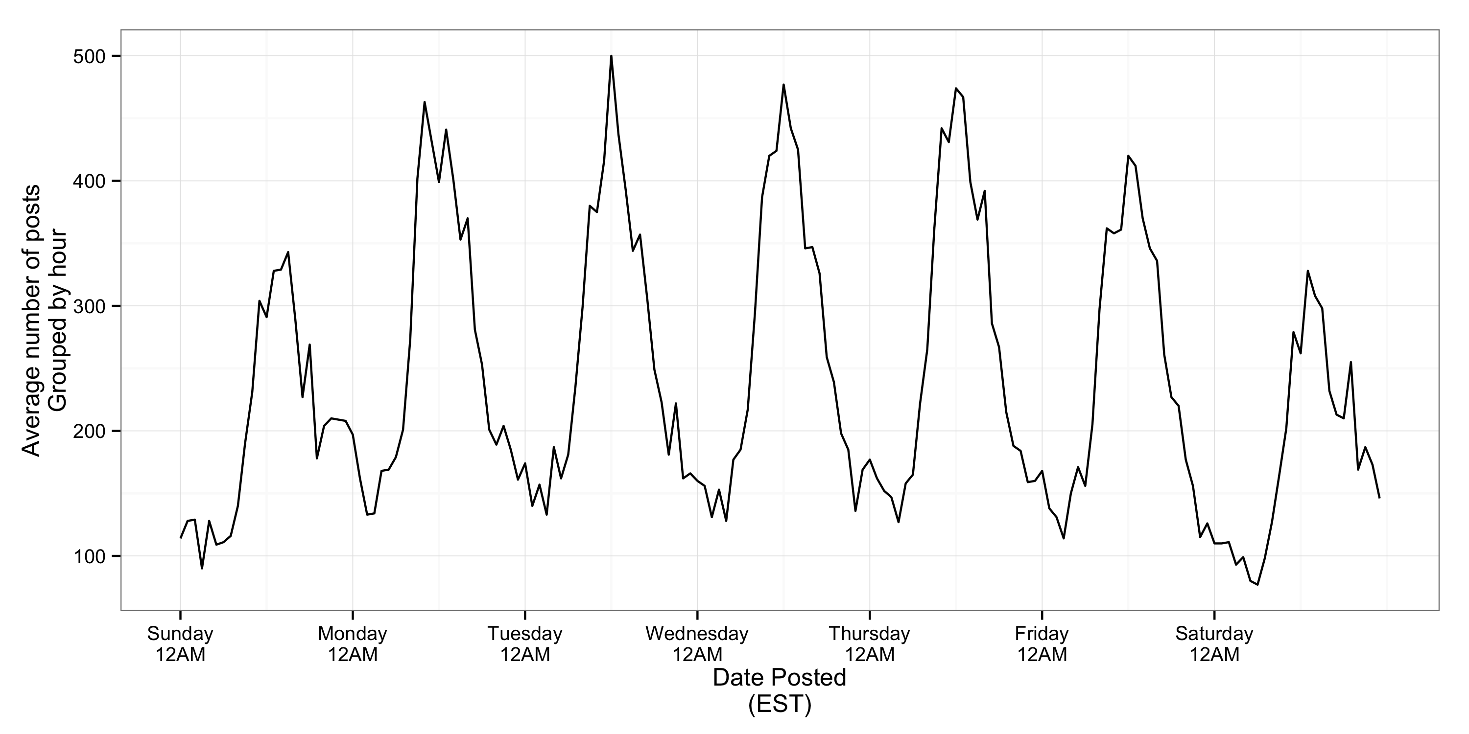
When are posts written?
More items are posted on weekdays, generally around midday (EST). This is consistent with my expectations – that most people who post on Hacker News are doing so from the US and Europe.
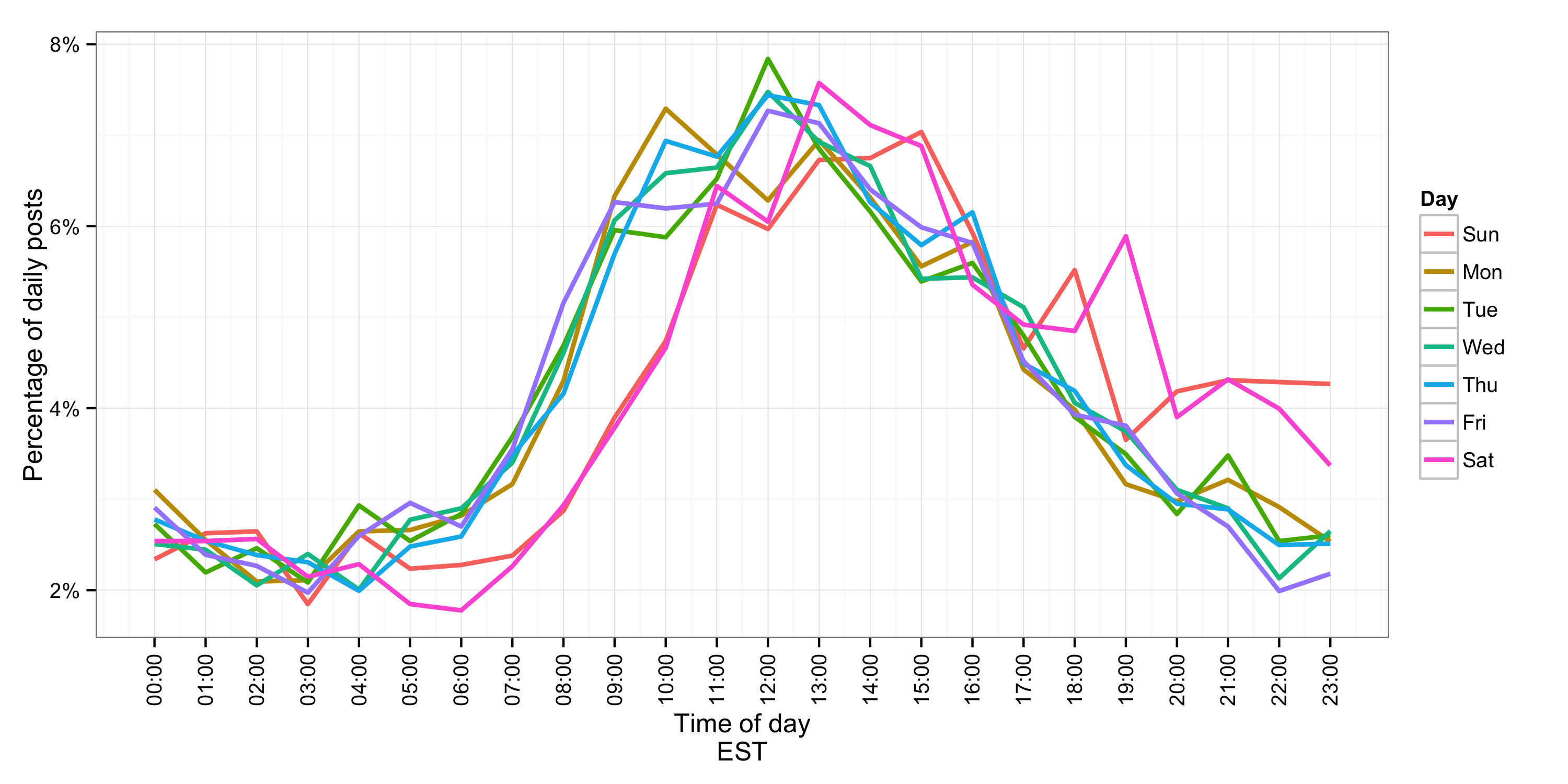
Interestingly, if we overlay each day on the same scale, we can see that posts occur later on weekends and continue into the night. I.e., I’m not the only one who’s wasted a Saturday night on Hacker News!
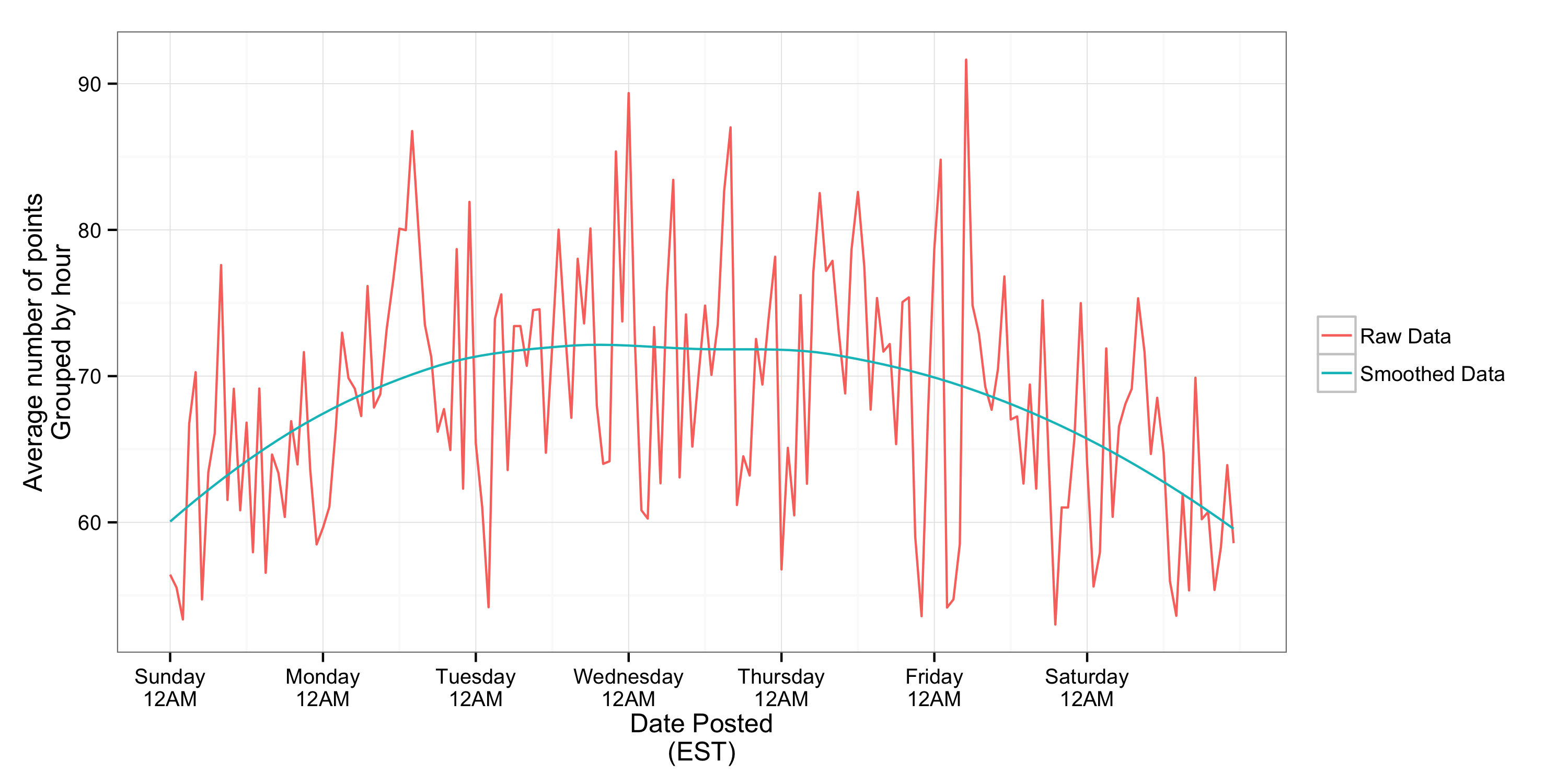
In terms of popularity of posts, there’s little relationship between time of day and popularity.
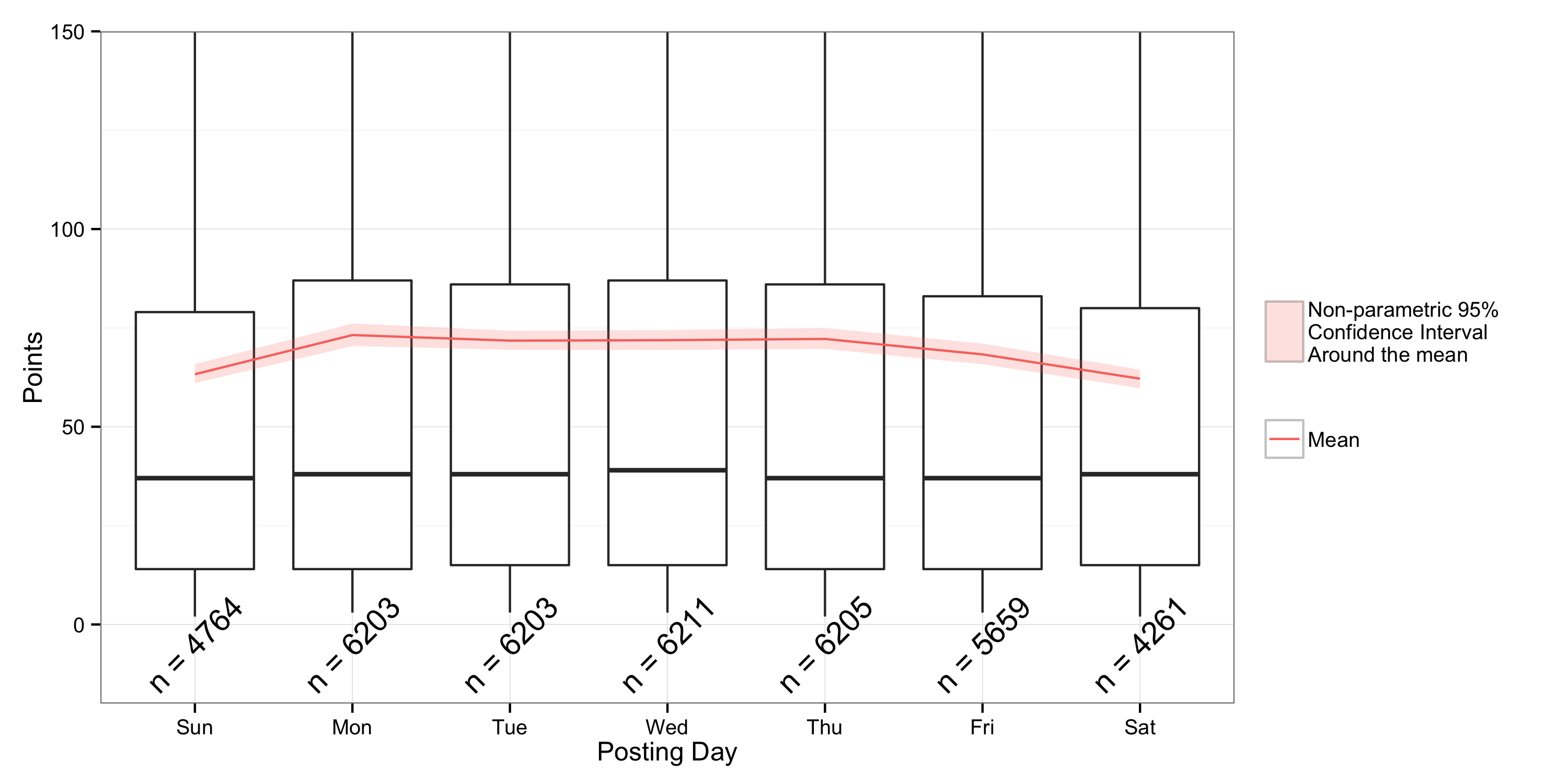
You may have noticed that there is a relationship between day of week and popularity of the posts. This relationship is statistically signifiant (using a non-parametric Mann-Whitney U Test) and I think more clear using boxplots.
What is posted?
One of the most interesting things to me about Hacker News is the diversity of posts. Below is a plot that shows how frequently a post comes from any site in each month. A couple slight caveats though: I only included sites that accounted for ≥2% of the posts in a month (everything else is in the ‘Other’ category), and I foolishly included ‘co.uk’ as it’s own site.
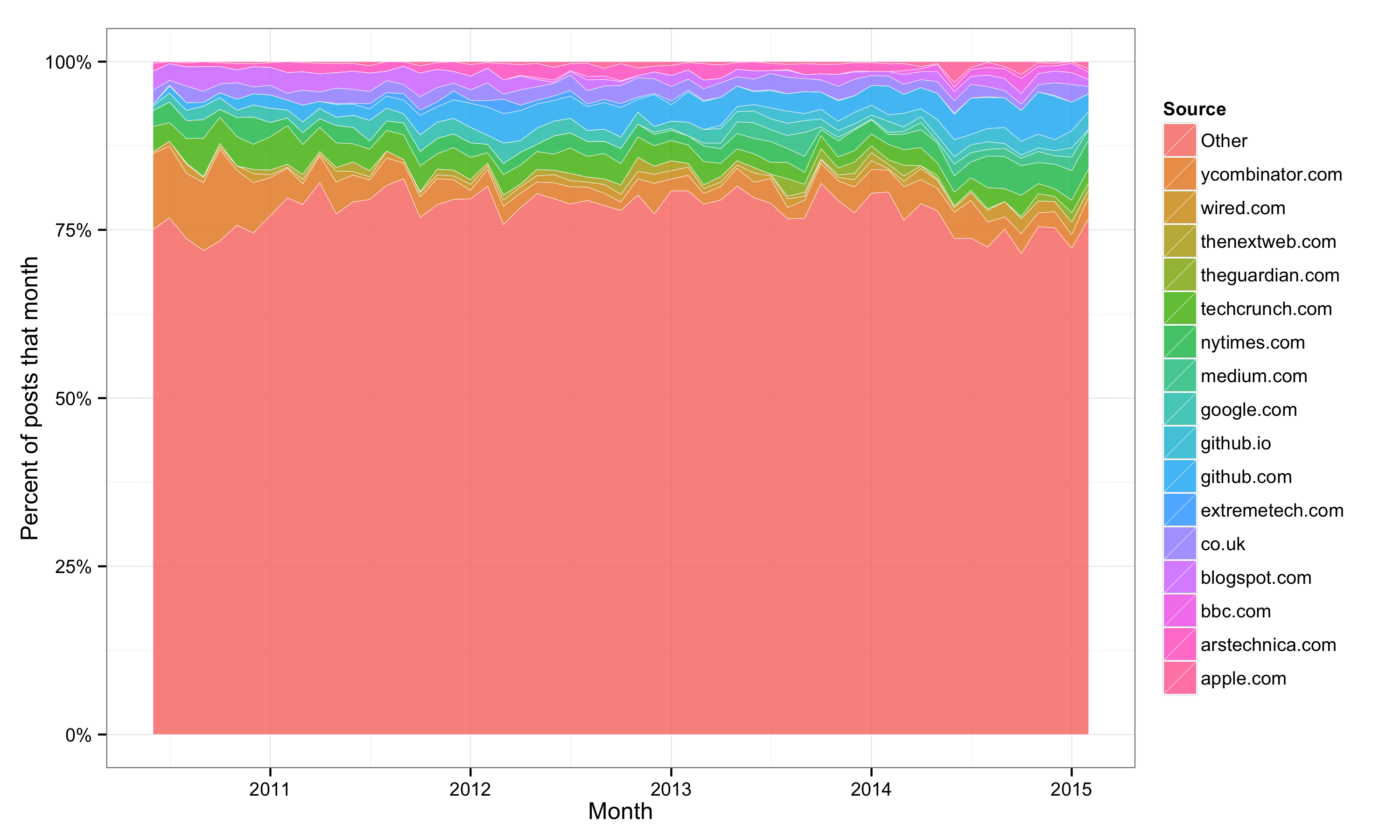
It is pretty clear that while there is a tech focus (techcrunch, ycombinator, wired, etc), no single site accounts for more than a tiny portion of the posts. I repeated this analysis for high scoring posts (> 100 points) and found essentially the same result. For comparison, roughly 60% of posts on reddit link to imgur.
I did a similar analysis of the users who submitted posts and high-scoring posts and again found very limited concentration.
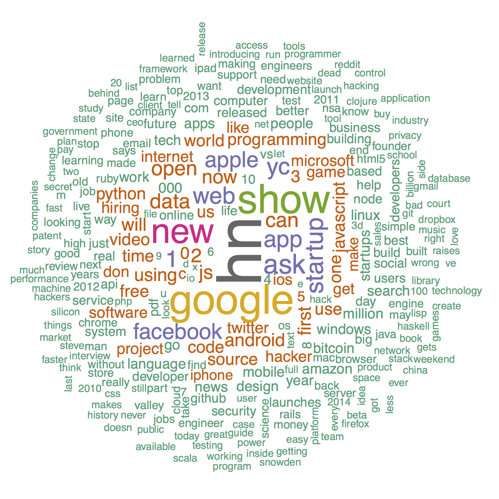
Now, on to topics. To begin, I wanted to see whether it was possible to categorize topics based only on their title. Of course, I first made a wordcloud of the titles (very important step in the scientific process).
I found that, using a k-means clustering algorithm (an unsupervised learning technique) on the overlapping words, I was able to create categories that seemed pretty meaningful. However, I found that these categories were not robust; i.e., when I reran the clustering algorithm I’d get new categories. The few that were fairly consistent were: Show/Ask HN, Google, and Windows/Microsoft. A few of the categories shown below are pretty interesting:
- The ‘attack’ category includes both ‘nuclear’ and ‘ddos’.
- The ‘color’ category includes both ‘blind’ and ‘palette’
- The ‘day’ category includes ‘zero’ and ‘demo’
- There’s an entire category for ‘love tablet’. It is best not to examine this too much.
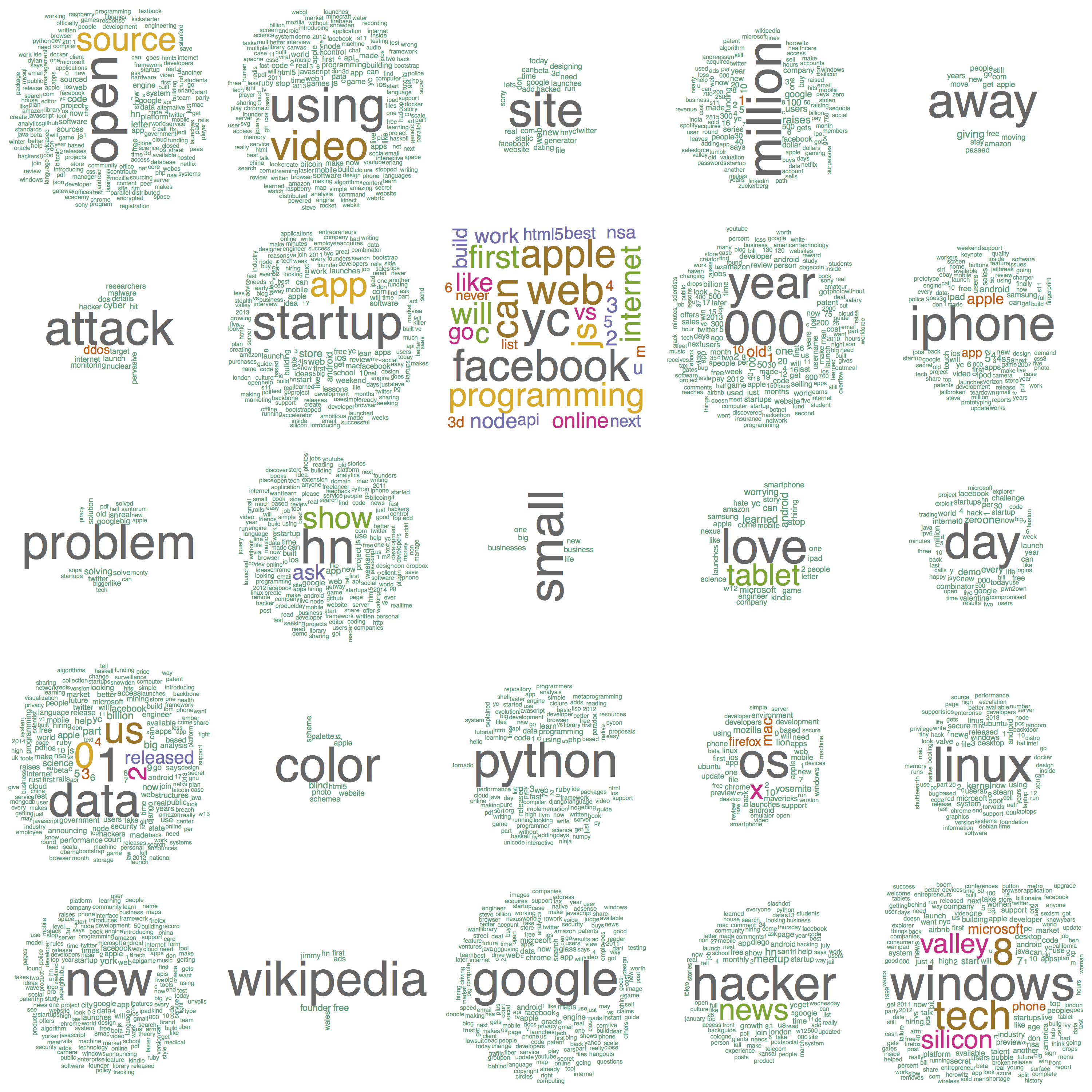
This shouldn’t be too surprising. Working with very short ‘documents’ means that coincident single words will define entire categories. This technique works better when you can compare longer documents.
More seriously, in the future I’d like to see whether I can find a better way to categorize the posts, likely using the content on page they link to (difficult) or comments on HN (more doable).
I then wanted to see whether any words were strong predictors of high/low scores. To do so, I ran linear regressions on the number of points for each post, and the presence of each word in that post. For example, I would look for a correlation between the number of uses of the word ‘google’ in a title and the points that post scored. Because the number of uses in the word is generally binary (either 0 or 1), this is roughly the same as asking “is the average score higher for titles using this word than for titles not using this word?”
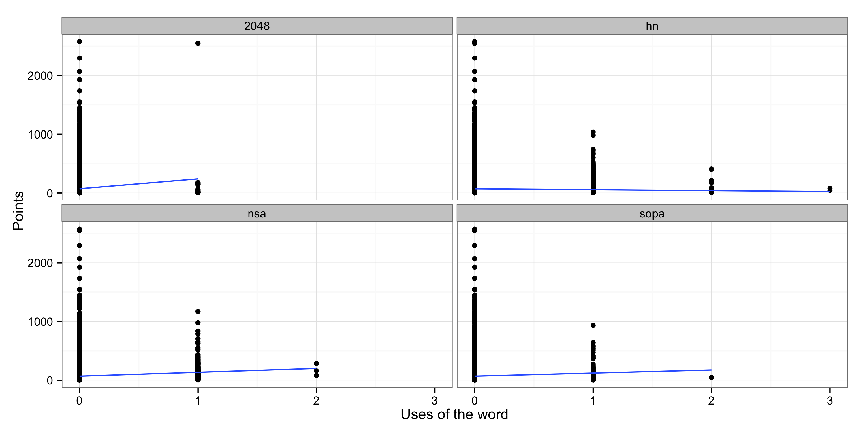
I then filtered these out to exclude uncommon words and words with an insignificant impact on the total point scored and found the following.
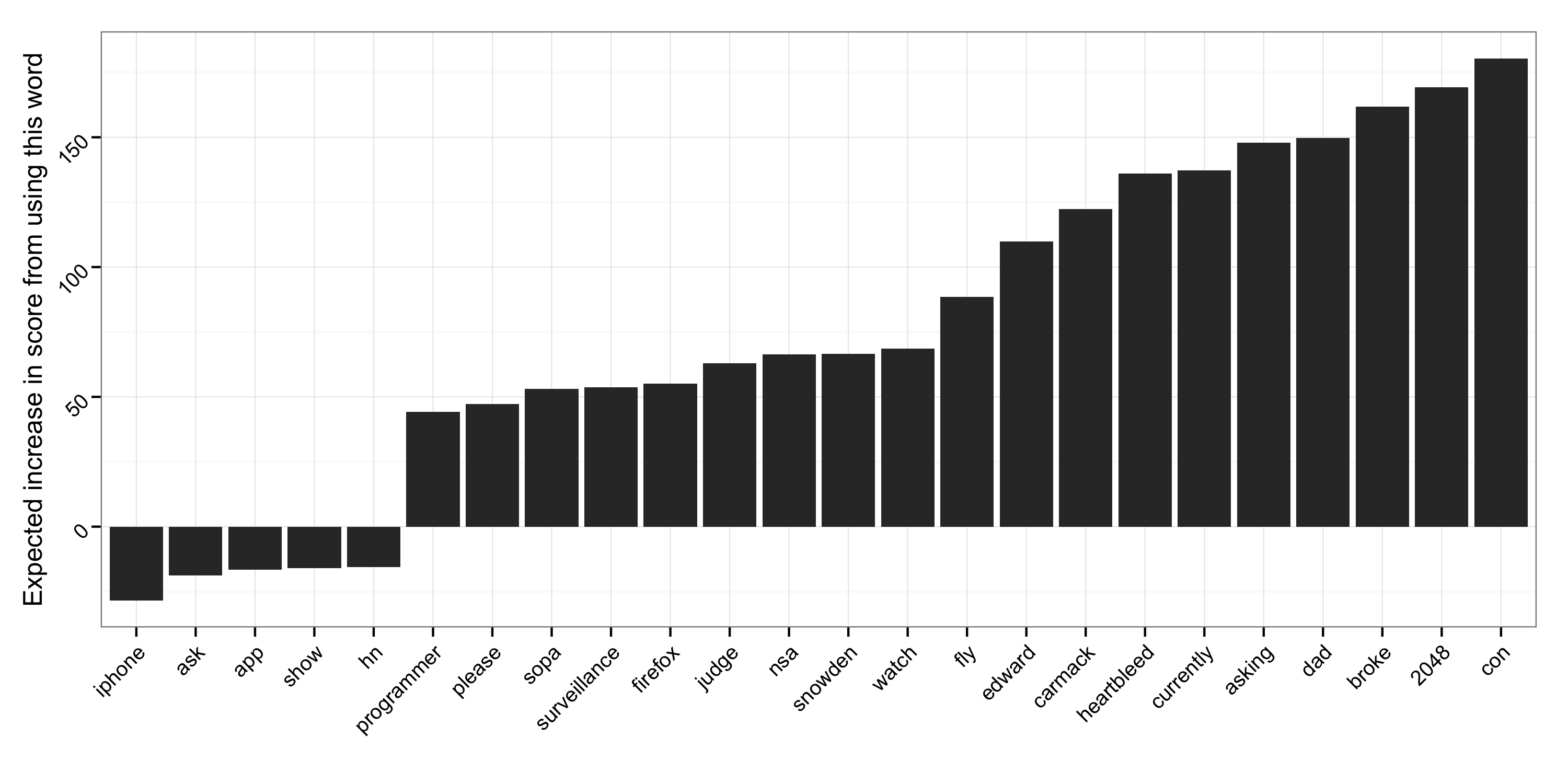
So using words like ‘iphone’ and ‘hn’ are correlated to lower scores, but words like ‘2048’ and ‘broke’ correspond to higher point totals. Apparently using ‘hn’ three times in one title didn’t help improve scores (or maybe these posts were just a little too meta).
Concluding thoughts
While none of the findings here are all that important, I think they are rather interesting. Especially the last few items: the (in)ability to classify only using the title and the relative importance of some titles over others.
More broadly, lots of these same tactics can be useful for more serious work, and it’s nice to have a data set on which to practice.