To log or not to log Part 1
I’ve noticed a frustrating phenomenon: the use of linear scales where a log scale would be much more appropriate. While people are more conscientious of deceptive charts now more than ever, misleading scales continue to be an issue. This is my brief rant against them.
While I have no idea whether this choice of scales is intentional or oversight, increasing awareness of users and makers seems like a suitable first step regardless. The purpose of this post and the following (short/occasional) series of posts is to give good reasons and cases in which log scales should be used.
Exponential Growth
This is the most obvious case for using a log scale rather than a linear scale. It seems like a forgone conclusion that when plotting a timeseries of values which naturally grow exponentially, one should use a log scale.
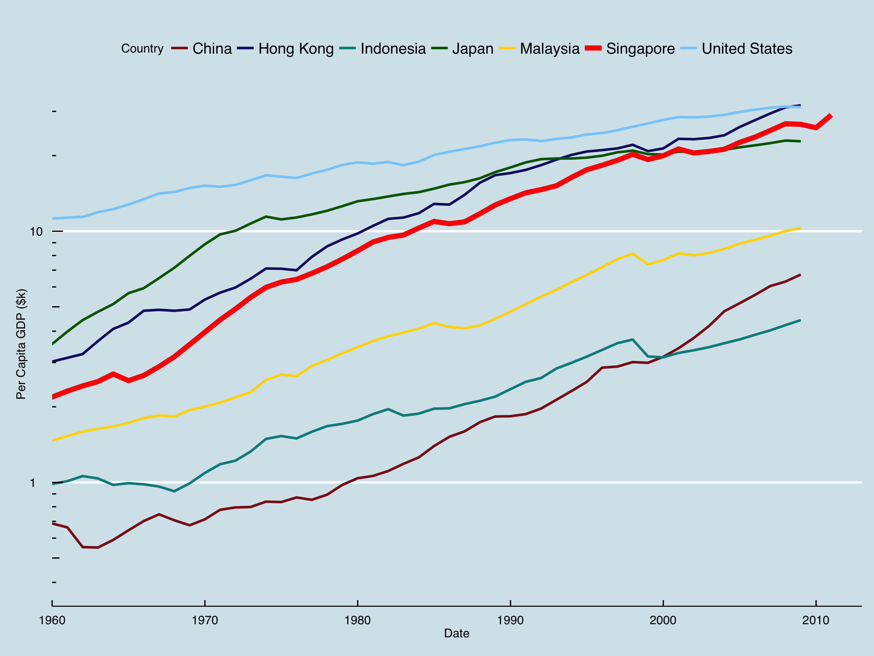
Singapore
Nonetheless, in the past week alone I’ve seen Harvard Business School and The Economist inappropriately use linear scales. Both extremely well-respected and generally unbiased, they nonetheless presented quite misleading views.
For example, the Economist presented a graph quite like the one below.
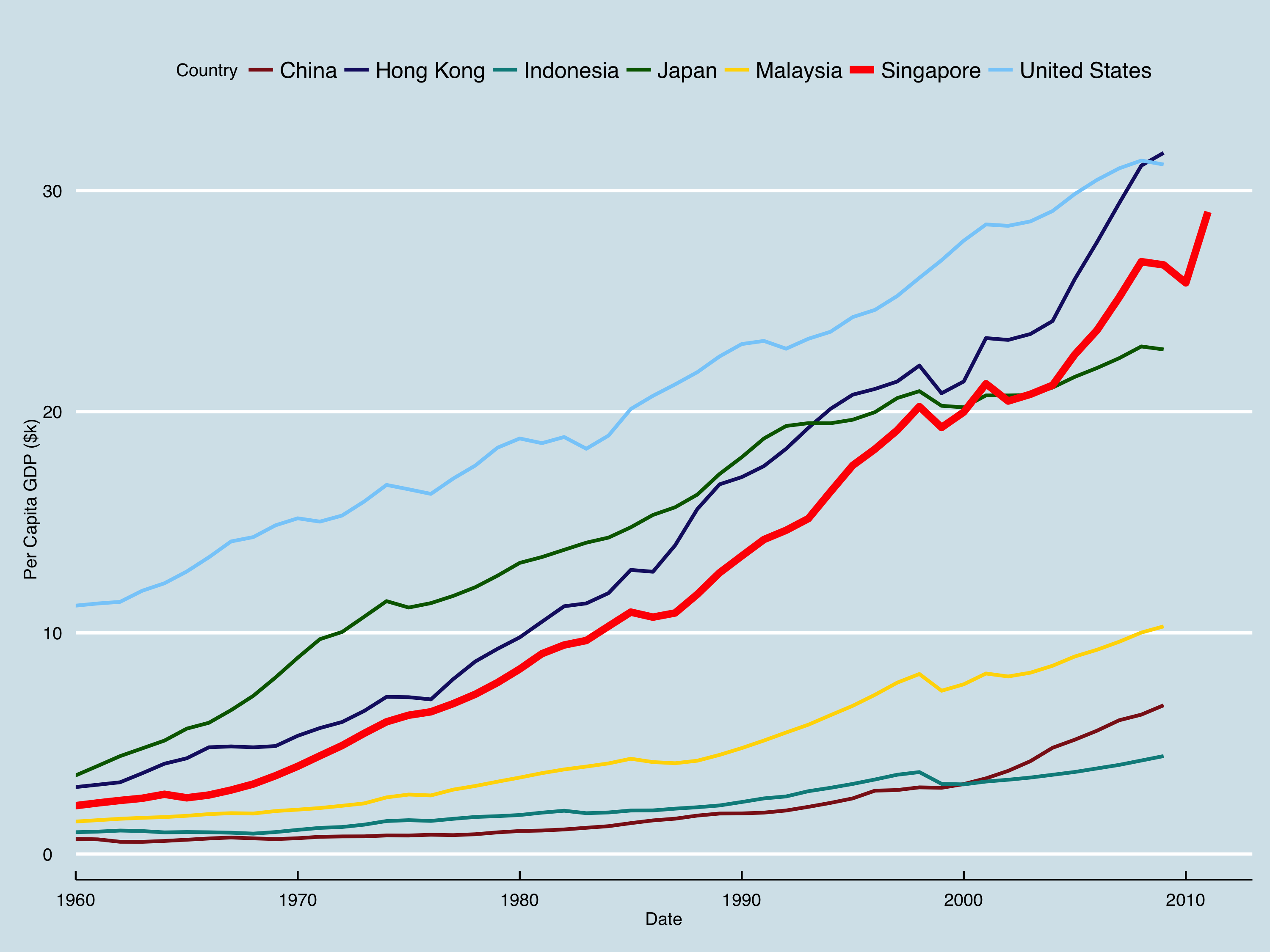
They concluded that this graph clearly showed how dramatic Singapore’s rise has been. While I agree with the conclusion, their visualization made it nearly impossible to tell that China’s rise has been similarly outstanding (even more so in the past 2 decades), or that post-war Japan was similarly meteoric. A better graph would have been the one below, with a log scale.
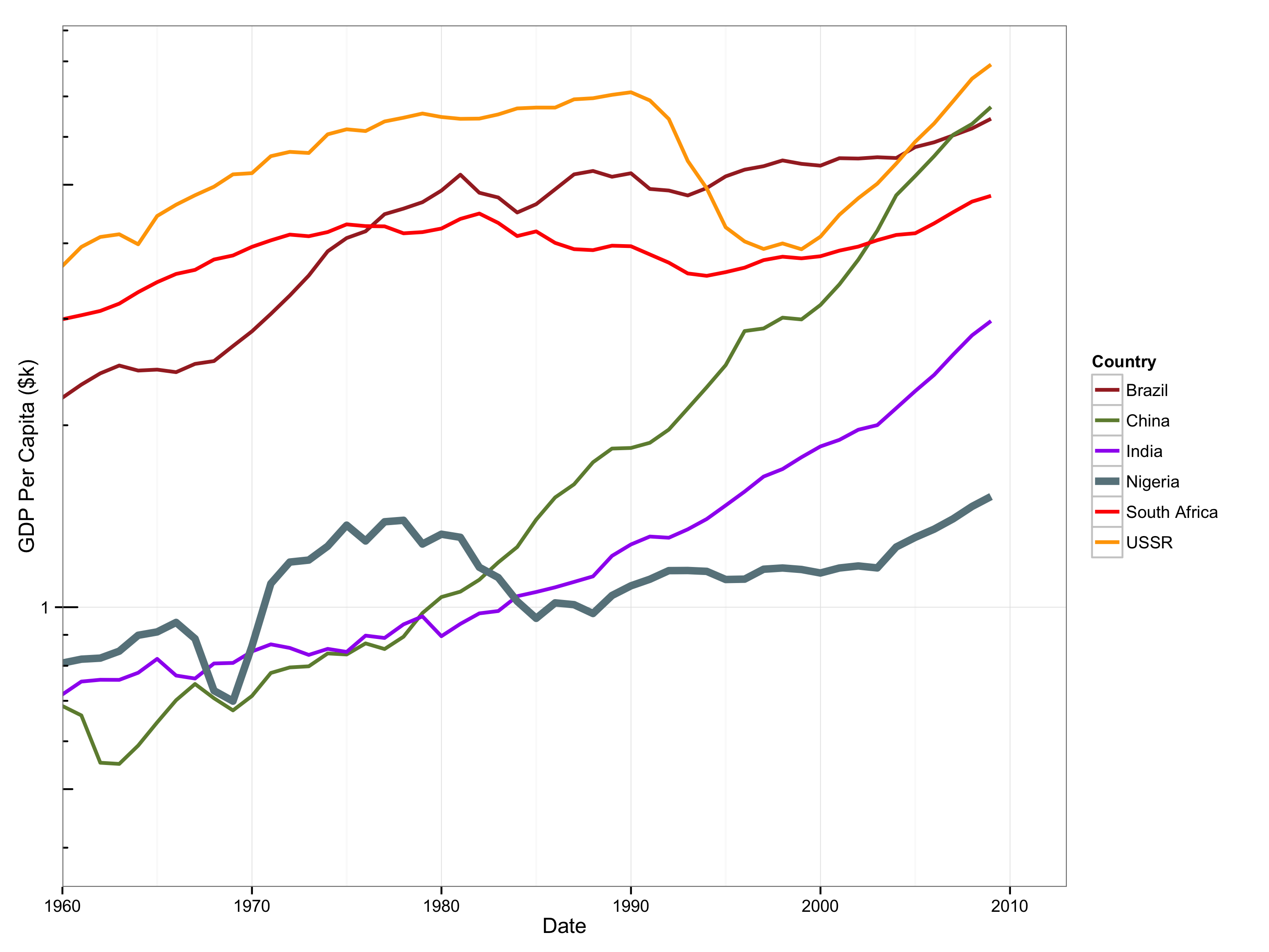
Nigeria
In a nearly identical situation, a professor of mine presented a graph like this:
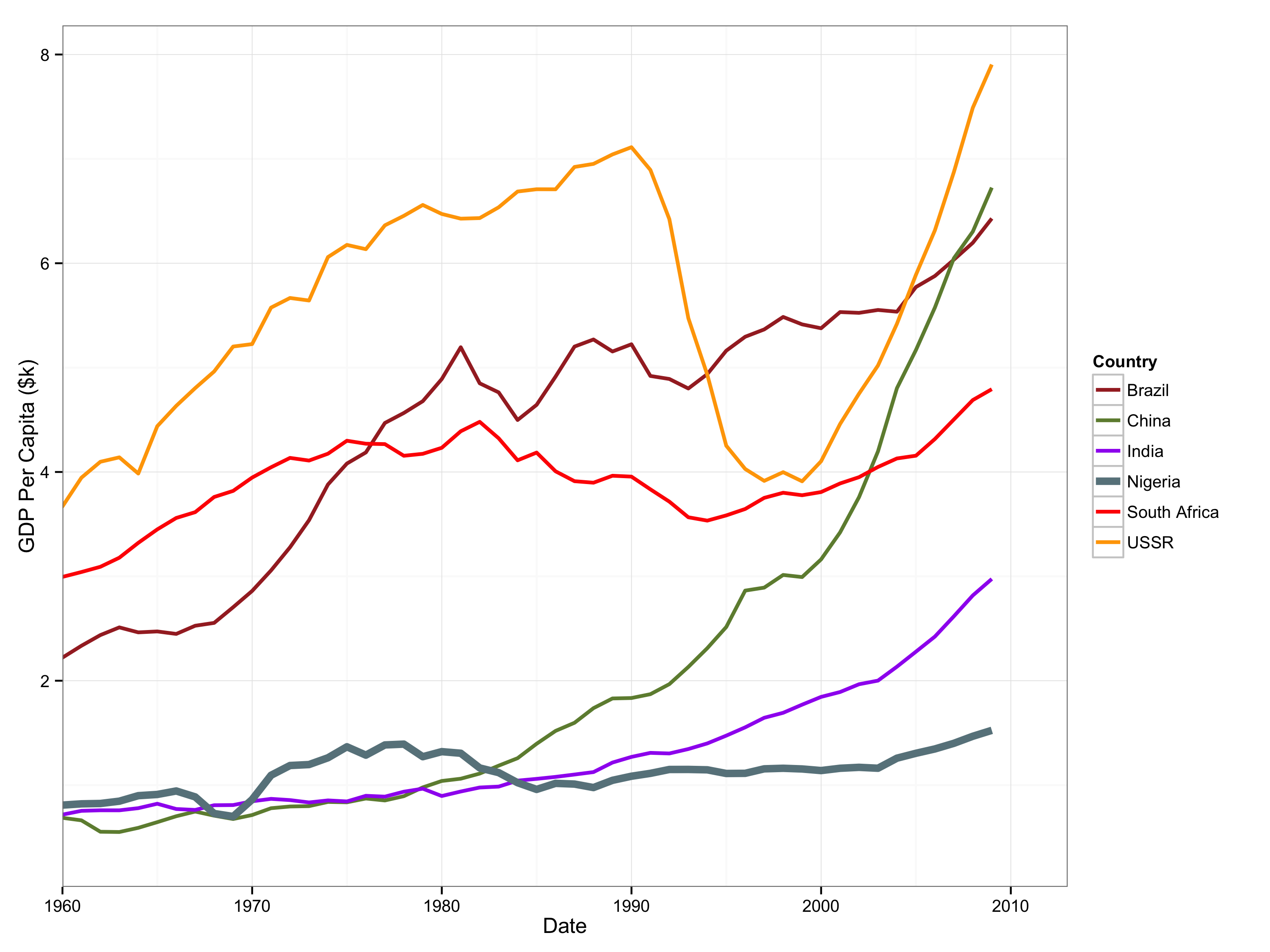
She claimed that this showed how Nigeria was struggling against the other BRINCS countries (Brazil, Russia, India, Nigeria, China, South Africa). To potentially oversimplify a long and complex history, Nigeria has been seen as a future economic powerhouse for the past 50 years, but various political, regional, and social issues have interfered. However, there has been substantial growth over the past decade and a half under the most recent series of leaders. The graph presented barely showed an uptick in GDP per capita, when in reality, GDP growth in the 2000s has been over 3%, in line with some other resource-dependent BRINCS countries (Brazil and South Africa). I think this point would have been clear had a log scale been used:
Conclusion
Exponential growth is the most straightforward case. While both the examples above were related to money, it truly applies to any case of exponential growth: money, population, etc.
The code used to generate the graphs above is available here. The data for this post came from The Maddison Project.